
5 new exercises to expand your artistic mind
improving how you take in the world is just as critical to your art as the normal skills you're used to hearing you need to work on
these exercises will help you see in new ways, a skill you can take back to all the art you do when you’re doing it toward your ongoing vision
you may not even have to finish the exercise to get the breakthrough moment you need — or you may find the endeavor so useful that you do it regularly, like as a warm-up or as its own step in your process for developing a final work
new ways to approach simplification, line, shape, form, value, color, texture, spatial relationships, proportion, light, perspective, design, composition, stroke quality, edges, etc., etc.:
draw every shape of an object you see — separately

ignore the bandaid wrapper and the handwriting, etc you could take it way further than I did with this [very foreshortened, by the way] paper towel roll abstraction [from life]…
—do highlights and shadows as their own shapes
—use a different color for each value (my example doesn’t make it super clear that that’s what’s happening)
—include negative shapes! (something I had not done)
are your shapes rightsized to each other?, what if you exaggerated one? why did you arrange them on the page like you did?
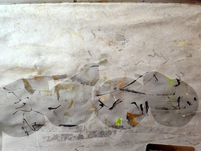
one-piece negative collage

a piece of tissue paper pasted on a wipeoff page in my hahnemuhle grey book I cut out one shape out of a piece of white tissue paper (and pasted it on a dirty and toned sketchbook page): the light behind a silhouetted row of pears
—test the strength of your design
—prioritize which edges require emphasis
—play with where you make the first snip
how much can you say with one negative shape? what can’t you say with just one negative shape?
expressive two-line portrait — without facial expressions

you could do an expressive portrait of a contemptuous tree, of an energetic cup, of anything; I did my unslick cat — he was facing away from me but had his ears facing me and trying to see me from the smallest possible sliver of his eye
—find the most important line
—use a brush pen (or brush and ink!) to vary the line widths
—notice how capable the human brain is at filling in the gaps
—embrace what makes your lines YOUR lines [mine are jerky and erratic — my line quality is objectively horrendous, but guess what? that’s real life, that’s really how my hands are, those lines are mine, I love those lines, I love the mood they impart on my work, on and on, “style” blah la la]
what aspect(s) of your expressive two-line portrait is the expressiveness?, the expressiveness?, the expressiveness itself? how does it compare to a continuous line drawing of the same subject?
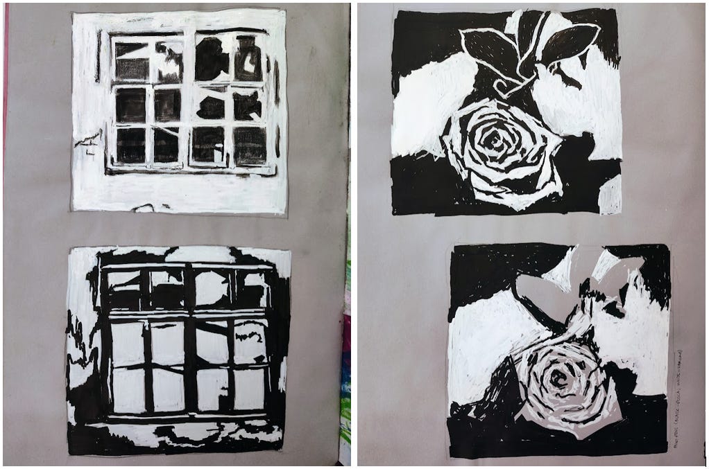
two notans of the same subject
how it goes, for me anyway, is I take a stab at a notan, realize everything “wrong” with the attempt and immediately make a second one
“wrong” is in quotes because it’s really more a visceral reaction than anything, but, yeah, the main thing I’m making notans for these days is for making it really obvious really fast what I like about the subject, what I care about bringing out most, where there’s an essential sneaky highlight, etc.

the flower on the bottom was the first notan — you can see where I stopped to start over on the second notan that is on top: when I realized the leaves or plant or whatever above the flower had lit edges they are great for strengthening your seeing of composition & design (and therefore great for strengthening your composing and designing!)
doing notans helps me process what I’m seeing in the language of composition & design — it’s like having a translator for me
vary aspect ratio of substrate vs. reference
years ago, I would crop a photo reference (or a piece of paper) to match my page (or match my photo reference), but I prefer now to intentionally mismatch the two
this has been an interesting way for me to strengthen my seeing of relationships — of shapes, space, proportion
you can’t rely on sketching according to rule-of-thirds (loosely grid method) or the subject’s relationship to its space in the photo itself, if that makes sense
you find new ways to see, solve different problems than you otherwise may have, and have more fun
here, I didn’t use a photo reference per se, but a print…
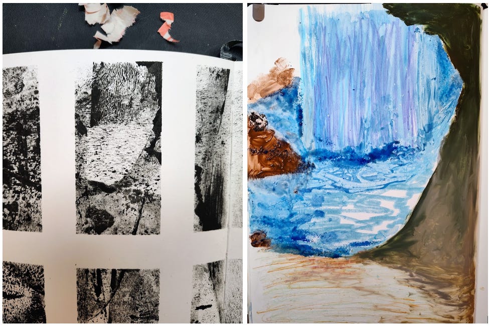
…that measures about 44.7mm by 90.8mm (not quite 1:2) whereas the painting (in process!) measures 210mm by 297mm (1:1.414)
I roughly kept the “waterfall” in the top third of the painting and the foreground spanning roughly the bottom third of the painting
imagine if this were a portrait instead — would you compress it proportionately? would you maintain the true proportions and instead leave off the subject’s chin entirely? would you include the subject’s entire face and end up with excess negative space?

I have more but will save them for next time, so stay tuned!
please let me know if you have any questions or anything on anything

otherwise, more to come

yours,
jansen